Five Reasons High Resolution Satellite Data isn’t Always Suitable for MRV
While it might seem counterintuitive: the highest resolution satellite data doesn’t always produce the highest quality results about the earth’s land cover and how it’s changing.
Commercially available Earth Observation imagery has evolved dramatically over recent decades, with resolutions of 30cm x 30cm per pixel now available, but at Space Intelligence our nature data maps use resolutions of 20m x 20m as standard.
Why? Well, the reality is that for forest carbon project monitoring, reporting, and verification, the data provided at this resolution produces the best results for the use case.
Read this short guide to learn about the factors that mean higher resolution imagery doesn’t directly translate to higher quality outputs.
The Factors that Impact Quality of Output
1. Suitability

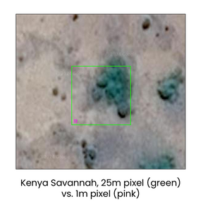
Take a savannah, for instance.
To define a pixel as being in the class ‘savannah’, you would expect to find scattered trees and grass in it. At 20m, this is fine – your pixel will likely have a combination of grass and trees. But at 1m, every pixel will likely have either tree or grass – so you couldn’t really have any ‘savannah’. You’d just have scattered ‘tree’ or ‘grass’ classes, which isn’t useful. You would then likely have to degrade the data back to 20m with some rule that mixed tree and grass areas are called ‘savannah’.
2. Data Quality
Really high resolution satellite data often comes in comparatively small sections, as effectively the data are captured using a big telescope on a satellite, meaning it can only look at a small part of the Earth’s surface.
These small patches are captured at different angles and different times of day, meaning they often do not match together well, creating a patchwork effect when combined into the final product. This patchwork is then integrated into the final product, with hard borders coming out between sections.
As an example, here is a section of a 1m resolution tree cover product produced by Meta covering the western Amazon (Brazil and Peru).

The rectangular stripes in the Meta product are an artefact of the different high resolution satellite images that make up its product. The Amazon rainforest does not really jump from 10m to 30m high forest in rectangular stages – this whole area has pretty uniform forest height of between about 25m and 35m.
This is an example where the inconsistency in high resolution datasets has resulted in a less useful output map.
Science quality data, at 10m to 30m resolution, from Sentinels or Landsat produce more accurate maps, that are consistent through time, than those built up with small, inconsistently-calibrated pieces.
3. Spectral resolution
People often focus on spatial resolution (as approximated by the pixel size), but it is spectral resolution (the number of bands representing different bits of the electromagnetic spectrum) that often impacts the results of maps more.
Generally, the more bands captured, the more useful the data at differentiating different landcover types or other features. The super high resolution satellites focus on spatial, not spectral, resolution. Operational satellites from ESA and NASA focus on spectral resolution instead.
For example, this figure shows all the 13 bands captured by the Sentinel-2 satellites.

Our eyes only see the light corresponding to bands 2/3/4 – but there is enormous amounts of information in the other bands.
The ‘red edge’ bands (5/6/7) contain information that helps us separate different types of plants, and even how stressed they are. Band 8 contains a lot of information on how much photosynthesis is happening in a pixel, and bands 11 and 12, in the short-wave infrared spectrum, see the world in a totally different way, helping separate vegetation types.
High resolution satellites often only collect data in a few of these bands, often focused on the visible bands (red/green/blue). Such data are great for looking at by eye, but not good for doing scientific classification.
Data across this broader range of spectral bands enabled us to create a record 28 land cover classes for our Scotland land cover maps.

4. Frequency of Data Collection

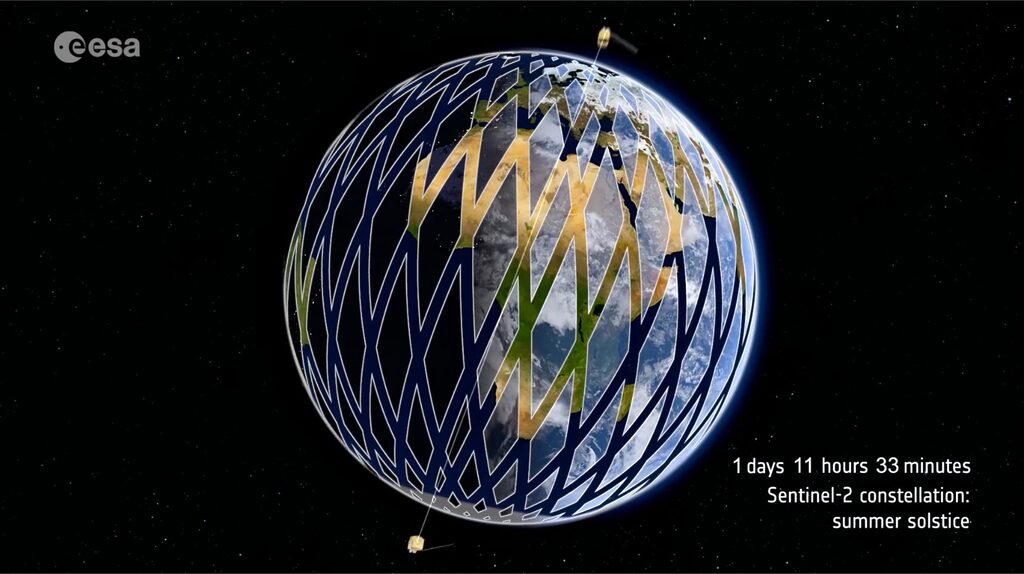
To get images captured in a consistent time-spaced pattern, you need data that’s collected often – the Sentinel-2 satellites collects at 10m resolution every 5 days, but super high-resolution data might be every 5-10 years.
Clearly there won’t be a large amount of change in a 5-day period, nor would we expect to update at this frequency, but it does enable a more frequent validation that a forest is still standing, or identification of natural or manmade destruction before it’s too late.
5. Efficiency of Data Processing
As touched upon above, another factor is processing time.
Clients may initially think they need data at 1m resolution, when in reality, they actually need around 1 ha (100m) resolution for most purposes.
There are 10,000 individual 1m pixels in a 100m pixel – so 1m requires 10,000 times the computing resource. We’d end up burning computing time (and creating a lot of carbon from data centres) producing enormous files that the client probably wouldn’t even have the capacity to view in a helpful way.
So, we find that 20m pixels, with ‘only’ 25 times more pixels than the 100m (1 ha) data that most clients need, is normally a good trade-off.
About Space Intelligence’s approach

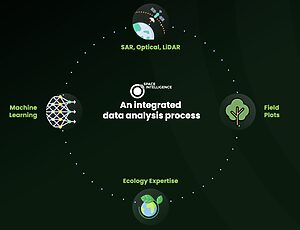
The maps of the nature on Earth’s surface, and how it is changing, that we produce at Space Intelligence are based on a wide variety of types of satellite data and use 20m x 20m resolution as standard to ensure we can provide the frequency, granularity, and accuracy of data that is needed for nature-based projects.
We mostly use ‘operational’ satellites, which are normally large satellites (think the size of a car with a 10m solar panel coming out the side) with well-calibrated sensors operated by space agencies (e.g. NASA, ESA).
These normally come in sets of 2 or more identical satellites to increase the frequency of image captures around the world, and provide redundancy in case one satellite fails. This makes them ideal for building our HabitatMapper and CarbonMapper data products.

